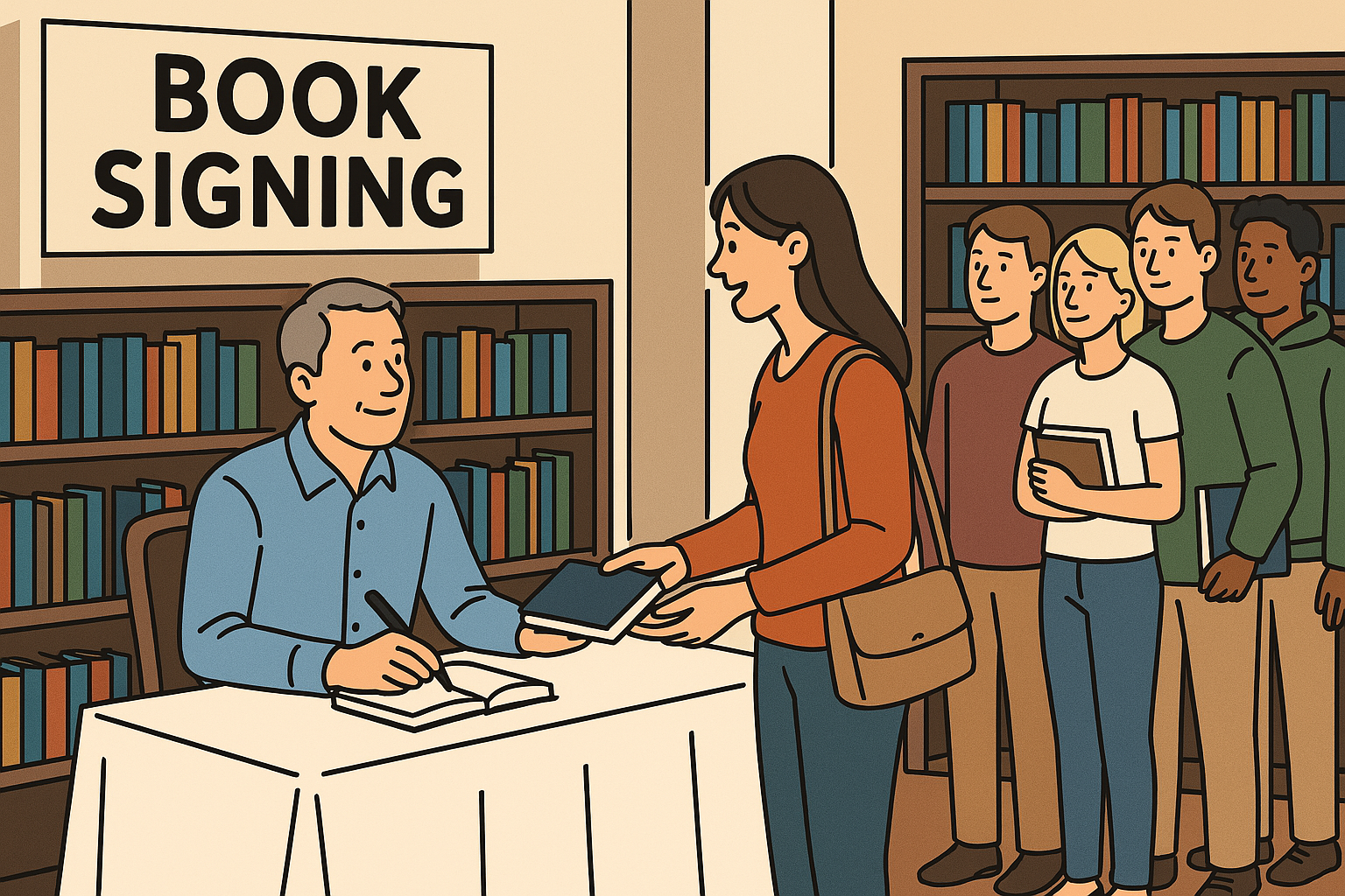
How to Create a Book Cover That Sells (For Fiction & Nonfiction)
Making a book cover that grabs attention and helps sell your book takes both creativity and planning. And yes, people really do judge books by their covers. As a self-published author designing your own cover, you have a great chance to make a strong first impression.
This guide will show you the most important design tips, explain the difference between fiction and nonfiction covers, and walk you through steps to do it yourself. You’ll also learn about useful tools and how to test your cover before you publish. Even if you’re not a designer, you can still make a professional-looking cover that helps sell your book.
Key Design Principles of a Cover That Sells
A book cover isn’t just decoration—it’s one of your best tools to attract readers. Here are the most important things to focus on:
Clear Focus and Simplicity
Good covers have one main image or idea and aren’t too busy. Too many pictures or words make it hard to understand. Try using one strong image along with your title. A simple, clean design is often more powerful than a crowded one.
Easy-to-Read Text
Your title and any subtitle should be easy to read, even when the cover is small (like a thumbnail online). Use fonts that are clear and big enough. Usually, the title should be the largest text, then the subtitle, then your name. Also, make sure the text stands out from the background. High contrast—like light text on a dark background—helps it pop.
Show the Right Genre and Mood
Your cover should make it clear what kind of book it is. A scary story will need a different look than a funny romance or a cookbook. Use images, colors, and fonts that match your genre. For example, dark colors and bold fonts may work for a horror book, while bright colors and playful fonts fit better with a kids’ story.
Make People Feel Something
Covers should make readers feel something right away. Fiction covers often show the mood of the story—like mystery, joy, or adventure. Nonfiction covers usually promise to teach or help the reader. A funny book should look fun. A serious book should look calm or bold. The design should match the feeling of the content.
Look Professional
Your cover should look like it belongs on a shelf with other books in your genre. That means using sharp, high-quality images and making sure everything is lined up neatly. Watch out for small things like spacing, font choices, and clear pictures. Don’t use stretched-out images or default fonts that look like clip art. Take your time and make it look polished—even if you’re doing it on your own.
By focusing on these principles – simplicity, readability, genre cues, emotional tone, and polish – you’ll be well on your way to a cover that not only looks great but also markets your book effectively.
Fiction vs. Nonfiction: Differences in Cover Design
Book cover design is not one-size-fits-all – the approach can differ significantly between fiction and nonfiction. Understanding these differences will help you tailor your DIY design to meet reader expectations in each category. Below is an overview of how fiction and nonfiction covers typically diverge:
| Aspect | Fiction Covers | Nonfiction Covers |
|---|---|---|
| Overall Goal | Spark curiosity and evoke the story’s world or mood. Fiction covers are like movie posters – they invite readers into an experience. | Convey the book’s subject and value at a glance. Nonfiction covers tend to promise clear information or a solution. |
| Title & Text | Concise titles; minimal front cover text beyond title/author. Rarely includes a subtitle on the front. This lets imagery speak for itself. | Often uses longer titles and descriptive subtitles to clearly explain the book’s topic or benefit. The subtitle is a key selling element. |
| Imagery | Expressive and imaginative. May show illustrations, characters, or symbolic scenes (e.g. a dragon silhouette). Visuals are less literal and more intriguing. | Straightforward or metaphorical imagery. Often a single icon or graphic tied to the topic (e.g. a brain for psychology). Sometimes no image—bold text does the work. |
| Typography | More creative freedom. Fonts reflect the story’s tone (e.g. whimsical for fantasy). Might combine fonts for flair but remains readable. | Clean and bold fonts for authority and simplicity. Prioritizes legibility. Often uses a strong sans-serif or serif font, with a complementary subtitle font. |
| Color Palette | Varies by genre. Can be vibrant or dark. Colors help set the mood (e.g. warm tones for romance, dark tones for horror). | Neutral or subdued colors dominate. Often solid backgrounds or simple schemes to convey professionalism. Bright colors used sparingly for emphasis. |
In short, fiction covers aim to ignite the imagination, relying on imagery and ambiance to lure readers into the story, whereas nonfiction covers aim to inform and persuade, using titles and visuals to promise specific value or knowledge. For example, a thriller novel’s cover might feature mysterious silhouettes and emotive typography to create suspense, while a business how-to book might have a bold title, a simple icon, and a subtitle explaining the outcome readers can expect.
Always consider your genre and audience expectations: a fantasy fan might expect a fantastical illustrated scene, while a nonfiction reader often wants to immediately know what they’ll learn. Tailoring your design to these norms will make your book instantly more recognizable and appealing to the right audience.
Step-by-Step Guide: How to Design Your Own Book Cover
You can design your own book cover! Just follow these steps and take your time. You don’t need to be a professional designer—just be creative and stay organized.
Look at Other Book Covers
Start by looking at covers from books like yours. Go to websites like Amazon or Pinterest and check out bestsellers in your genre. Pay attention to the pictures, colors, fonts, and layout. Ask yourself:
- What do these covers have in common?
- What makes them stand out?
Save some covers you like. These examples will help give you ideas for your own design.
Pick a Design Tool
Next, decide what tool you’ll use to make your cover. Here are a few easy options:
- Canva – A simple drag-and-drop tool with free templates.
- Book Brush – A tool made for authors with book cover layouts.
- Microsoft Word or Google Slides – Simple, but a bit limited.
- Photoshop or InDesign – For more advanced users.
- GIMP – A free program similar to Photoshop.
Pick the one that feels easiest for you. You can also buy a premade cover and just add your title if you want a head start.
Know Your Size and Format
Before you begin designing, figure out what size your book cover needs to be.
- Ebooks only need a front cover (usually a tall rectangle).
- Printed books need a full cover: front, back, and spine.
Each printing company (like KDP or IngramSpark) has different rules. They tell you the right size and file type to use. Some even give you a template to follow. Make sure to check things like:
- Page size
- Spine width (based on page count)
- Bleed area (extra space for trimming)
- Image resolution (usually 300 DPI for printing)
Doing this step right will help your cover print clearly and fit perfectly.
Plan the Layout and Choose Images
Now sketch out your cover layout. Think about:
- Where will your title go?
- Where will your name go?
- Where should the picture or artwork be?
Choose one strong image for the cover. This can be a photo, drawing, or graphic. Make sure your image:
- Looks sharp and clear (not blurry)
- Is legal to use (from a stock site or your own work)
- Matches the theme or message of your book
For nonfiction, you might use something symbolic, like a lightbulb for new ideas. For fiction, you could use a character, setting, or object from the story. If you’re not an artist, don’t worry! You can still make a great cover using free stock images.
Pick a Color Scheme
Colors matter! They help show the mood of your book.
- Dark colors (like red or black) might fit a mystery or thriller.
- Light colors (like blue or white) feel calm and clean.
Try using 2–3 main colors that go well together. Make sure the text stands out from the background. For example, use light text on a dark background, or dark text on a light one.
You can also use a color from your main image to match the title text. This helps everything look like it belongs together.
Think about what the colors say to the reader—do they show fun, fear, trust, or excitement? Picking the right colors will help your cover grab attention and feel complete.
Design Your Title and Author Name
Now it’s time to add the words to your cover. This is called typography, and it’s very important. Pick fonts that are easy to read and fit the style of your book. Here are some tips:
- Use no more than two fonts. One font can be fun or fancy for your title. The other should be simple for your name or subtitle.
- Make the title the biggest text. Put it in the center or top so people see it right away. Your name can be smaller unless you’re a well-known author.
- Check the size. Make sure you can read the title when it’s small, like a thumbnail image on a website. If it’s hard to read, try a different color or add an outline.
- Keep it neat. Line up your text carefully. Don’t let the words touch the edges or get too close to the picture.
- Avoid hard-to-read fonts. Stay away from super curly or squiggly fonts. They might look cool, but they’re not easy to read.
A clean and bold title makes your book look more professional and helps it stand out.
Put It All Together
Now you can finish your design! Add your image, colors, and text to the cover.
- Step back and look at it. Does your eye go straight to the title and picture?
- Make sure everything looks balanced—not too crowded or too empty.
- Keep enough space around the edges so nothing gets cut off when printed.
Try moving things around—maybe the title looks better at the top, or maybe a different font works better. Simple designs with strong contrast (light text on a dark background or dark text on a light background) often work best.
If something feels off, it could be because things aren’t lined up or spaced right. Ask a friend to look at it with fresh eyes. They might catch something you didn’t notice.
Test Your Cover and Ask for Feedback
Before you finish, show your cover to others and ask what they think.
- Try making two versions with different fonts or colors. Ask people which one they like best.
- Share your cover in author or reader groups online. You can even ask a librarian or bookstore worker—they see lots of books and can give good advice.
- Don’t just ask friends or family. They might not give honest answers because they want to be nice.
- Some authors use special websites like PickFu to test two covers and see which one people like more. Others run a small ad online to see which cover gets more clicks.
Use this feedback to fix any problems. For example, if several people say the subtitle is too small, make it bigger and easier to read. Getting advice now can save you from using a cover that looks good to you but doesn’t connect with readers.
Final Steps: Save and Export Your Cover
Once you’ve picked the best version, it’s time to finish!
- Double-check for spelling errors in your title and name.
- Make sure everything is lined up and the colors look good.
- For print books, save your file as a PDF with the front, back, and spine.
- For ebooks, save the front cover as a high-quality JPEG.
You can also use tools that make 3D mockups to see how your cover will look on a real book. These are great for showing off your cover in ads and posts.
Save your original files too, just in case you need to make changes later.
Congratulations! You’ve created your own book cover!
Easy Tools to Help You Design Your Own Book Cover
You don’t need to be an artist or go to art school to make a great book cover. Today, there are many easy tools that help authors design covers by themselves. Here are some of the best ones you can try:
Canva
Canva is a very popular free design website. It’s great for beginners.
- You can choose from pre-made book cover templates.
- It’s easy to use—just drag and drop pictures, colors, and text.
- You can pick your fonts, change the background, and add images.
- Tip: Type “book cover” in the search bar to find the right size.
Canva has a free version with lots of features. There’s also a paid version with more tools, but you don’t need it to make a nice cover.
Book Brush
Book Brush is made just for authors.
- It has book cover templates for different genres.
- You can also make 3D book images and graphics for ads or social media.
- The free version gives you a few downloads each month. If you want more, you can pay for a plan.
Many self-published authors like Book Brush because it’s simple and has everything they need to make covers and other marketing images.
Adobe Photoshop or InDesign
These are advanced tools used by professional designers.
- They give you the most control over your design.
- You can do more complex things like mixing images and adding special effects.
- Adobe has free online tutorials to help you learn.
But there are two downsides:
- They cost money (you have to pay every month).
- They can be hard to learn if you’re new to design.
Still, if you’re willing to practice, these tools can help you make very high-quality covers.
GIMP (GNU Image Manipulation Program)
GIMP is a free tool that works a lot like Photoshop.
- You can use it to add text, adjust colors, and combine images.
- It’s more advanced than Canva or Book Brush but not as easy to use at first.
- If you want powerful editing without paying money, GIMP is a good option.
It might take some practice, but many people use it to make high-quality designs.
Premade Book Covers
If starting from scratch is too hard or takes too long, you can buy a premade cover instead.
- Websites like SelfPubBookCovers and The Book Cover Designer sell thousands of covers made by designers.
- You pick one you like, then add your book’s title and your name.
- Most covers cost between $50 and $150.
These covers are sold only once, so your book will still have a unique look. You can also find templates from places like Joel Friedlander’s Book Design Templates, where you just type in your info. It’s a quick and easy way to get a professional-looking cover.
Stock Photo Websites
If you need a photo for your cover, try using stock photo sites.
- Paid sites: Shutterstock, iStock, Depositphotos
- Free sites: Unsplash, Pexels, Pixabay
You can find pictures of just about anything—like a spaceship for a sci-fi book or a lightbulb for a book about ideas. Just make sure the photo is allowed for book covers. Some require you to buy a license or give credit.
Font Websites
Want a cool font for your title? Try these free sites:
- Google Fonts – A huge collection of free fonts.
- DaFont and Font Squirrel – Free, but make sure the font says it’s okay for commercial use (for selling books).
Pick a font that’s easy to read and fits your book’s mood. For example, don’t use a silly font on a serious book. Also, make sure the font isn’t too common—your book should still feel special.
Design Tools Ease of Use
5. Adobe Photoshop or InDesign
4. GIMP (GNU Image Manipulation Program)
3. Book Brush
2. Canva
1. Premade Book Covers
Looking at other covers can help you get ideas and understand what works. And if you ever feel stuck, you can always ask a professional designer for advice. Some offer small services, like reviewing your design or giving you feedback.
Easy Tips for Typography, Pictures, and Colors
Let’s talk about three important parts of your book cover: fonts (typography), images, and colors. These all work together to make your cover look great and grab a reader’s attention. In this section, we’ll focus on font tips to help your title and text stand out.
Font Tips (Title & Text) Make It Easy to Read
Your title should be super easy to read.
- Use big, clear letters.
- Don’t pick a font that’s too fancy or hard to understand.
- Try the “thumbnail test”: Shrink your cover down—can you still read the title? If not, try a different font, size, or color.
Don’t Use Too Many Fonts
Stick with one or two fonts.
- Using too many can make the cover look messy.
- Try a fun or bold font for your title, and a simple one for your name or subtitle.
- Make sure the fonts look good together and match the feeling of your book.
Pick Fonts That Fit Your Book Style
Different kinds of books should have different types of fonts.
- A spooky story might use sharp, scary-looking letters.
- A business book might use strong, clean letters.
- A fantasy might use fancy, old-style letters.
Look at other popular books in your genre to get ideas for what kind of font works best.
Make the Title the Star
Your title should be the biggest and most noticeable text.
- Put it in the center or top so it’s easy to see.
- Your name can be smaller, unless you’re a famous author.
- If you have a subtitle, make it smaller and place it under the title.
Make sure the title color stands out from the background. If needed, add an outline or shadow to help it pop.
Don’t Overload the Cover With Words
Too much text makes the cover feel crowded.
- Stick to just the title, subtitle (if needed), and your name.
- Leave reviews, quotes, or extra info for the back cover or book description.
- Keep it clean and easy to understand at a glance.
Keep the Text Neat and Spaced Well
Line up your text nicely and leave some space around it.
- Don’t put text too close to the edges.
- Make sure your subtitle isn’t too close or too far from your title.
- Try centering your text, or use left-align—but be consistent.
When your fonts look neat, clean, and easy to read, your book cover will feel more professional. Fonts may seem small, but they can make a big difference in helping readers notice your book—and want to read it!
Picture and Graphic Tips for Your Book Cover
Pictures are a big part of a great book cover. Let’s go over some easy tips to help you choose and use images the right way.
Pick One Strong Image
Most good book covers have one main image that grabs attention.
- This can be a character, object, or symbol.
- For fiction books, you might show the main character or setting—like a castle or spaceship.
- For nonfiction, use something that represents the topic—like a puzzle piece for a problem-solving book or a lightbulb for an ideas book.
Try not to use too many pictures. That can make the cover feel messy. Choose one powerful image that tells the story of your book.
Use Clear, High-Quality Images
Your cover needs to look sharp—not blurry or stretched.
- Always use high-resolution images that stay clear when printed.
- Don’t take images from random places online—some are not free to use.
- Use stock image websites or get permission before using an image.
Using the right image the right way makes your cover look professional.
Think About Where You Place the Image
Where you put your picture matters.
- The image and the title should work together, not block each other.
- For example, if the image shows a person’s face, don’t put text over it.
- Make sure the title stands out—add a shadow or box behind the words if needed.
Try to balance the picture and text so your eye moves smoothly from one to the other. Some people use a rule called the “rule of thirds” to help with this. Imagine your cover divided into a 3×3 grid and put the most important parts at the points where the lines cross.
Match the Picture to Your Genre
Your image should match the kind of book you’re writing.
- A romance book might show a couple.
- A mystery might have shadows or a key object like a magnifying glass.
- A nonfiction book might use a symbol like a graph, brain, or lightbulb.
Avoid pictures that send the wrong message. For example, don’t use cartoon art on a serious crime book. Always ask yourself: “If someone only saw this picture, would they guess the type of book?”
Avoid Overused Images
Some images are used on too many covers (like the same couple pose in romance books).
- Try to find an image that feels fresh and different.
- You can make a common picture feel new by changing the colors or cropping it in a creative way.
But don’t be so different that readers don’t know what your book is about. It’s better to be a little familiar and clear than confusing and strange.
Photo or Illustration?
Think about what style fits your book best:
- Illustrations are great for fantasy, kids’ books, or fun adventures.
- Photos work well for thrillers, romances, or nonfiction books.
- Some covers use simple shapes or icons, especially in nonfiction.
Use whatever style you feel most comfortable with. If you can’t draw, don’t worry—photos or stock images work just fine. Some authors even hire an artist to make a custom drawing if they want something unique.
Use one strong image, make sure it’s clear and allowed, place it well, and match it to your book’s style and audience. A great picture with the right title can stop readers from scrolling and make them want to click on your book.
Easy Color Tips for Your Book Cover
Colors do more than just make your book cover pretty—they help tell your book’s story and grab the right readers. Here are some simple tips to help you choose the best colors for your cover.
Use Colors That Match the Mood
Colors can make people feel certain emotions. Think about the feeling of your book and choose colors that match.
- Warm colors (red, orange, yellow) can feel exciting, fun, or cozy.
- Cool colors (blue, green) can feel calm, serious, or even spooky.
For example:
- A scary story might use black or dark red.
- A happy story or memoir might use yellow or soft colors.
- A book about nature might use green and brown.
Pick colors that fit your book’s message or vibe.
Stick to Just a Few Colors
Don’t use too many colors at once—it can look messy.
- Try to use 2 to 3 main colors.
- One color can be the background.
- Another color can be for the title or small details.
A good trick: Pick one color from your image and use it in your text. This helps everything look like it belongs together.
Also, look at books in your genre:
- Business books often use one bold color (like orange or blue) with white text.
- Fantasy books might use many colors but still keep the same tone, like mostly dark blue or gold.
Make Sure the Text Stands Out
Your title and name must be easy to read!
- Use light text on a dark background, or dark text on a light background.
- If your background image is busy, add a box or outline around the title to help it stand out.
- Don’t pick fancy color tricks that make words hard to read.
Also, if your whole cover is the same shade, it might look flat. Add a pop of a different color (like orange on blue) to catch the eye.
Know What Colors Match Your Genre
Different types of books often use different color styles:
- Thrillers or horror use black, red, or dark gray.
- Romance books use pink, purple, or warm soft colors.
- Sci-fi often uses black, blue, or neon colors.
- Self-help or spiritual books use white, light blue, or green.
You don’t have to follow these rules exactly, but they’re helpful. A fun cookbook shouldn’t have a jet-black cover—it might give the wrong idea!
Look at bestselling books like yours. That will help you see what colors readers expect.
Think About Color Psychology
Colors can give people a feeling even if they don’t notice it.
- Blue = trust, calm, strength
- Red = energy, action, passion
- Green = growth, nature, peace
For example:
- A book about meditation might use green or blue.
- A book about sales might use red or orange.
This isn’t an exact science, but color psychology is a fun way to help your cover connect with readers.
Check Your Colors Before Printing
If you’re printing a physical book, test your colors first.
- Sometimes bright colors on a screen look dull when printed.
- What looks like neon orange on your computer might come out brownish in print.
- Try printing a sample at home or checking it in print mode (CMYK format) on your design tool.
Also think about how your cover looks in black and white, since e-readers like Kindles often show grayscale. High contrast designs (light and dark together) usually work best.
Pick colors that match your book’s mood, use just a few strong colors, and make your text easy to read. A smart color choice can make your book stand out and stick in readers’ minds—just like a bright yellow or bold black cover you never forget.
Common Book Cover Mistakes to Avoid
Even if you’ve worked hard on your cover, small mistakes can still hurt your book’s chances. Here are some common problems to watch out for—and how to fix them:
Messy Layout (Too Much Going On)
Sometimes people just toss pictures and words on the cover without a plan. This makes the cover look confusing or messy.
- Don’t place things randomly.
- Make sure everything is lined up and not too close to the edges.
- Keep things balanced—your image, title, and name should work together.
A clean and neat design will always look more professional than one that feels thrown together.
Bad Font Choices
Picking the wrong fonts can make your book look unprofessional.
- Don’t use too many fonts—stick to 1 or 2.
- Make sure your fonts are easy to read and fit the style of your book.
- A silly font on a serious book just looks wrong.
Also, avoid fonts that are used on too many other books. And always double-check spelling—a mistake in your title or name on the cover is a big problem.
Hard to Read When Small
Online bookstores like Amazon show your cover as a tiny thumbnail first.
- If your text is too small or the colors are too light, people won’t be able to read it.
- Shrink your cover down and check—can you still read the title?
- If not, use bigger text, strong contrast, or try a clearer font.
If readers can’t read your title in a small size, they’ll probably scroll past without clicking.
Blurry or Low-Quality Images
A blurry photo or a stretched-out picture can make your book look cheap.
- Never use images that are pixelated (fuzzy) or look like they were cut out badly.
- Avoid clipart-style pictures that don’t match the rest of your design.
- Use high-quality images that are clear and sharp.
If you’re combining pictures, make sure they fit together smoothly. If something looks off, try a better image or learn how to clean it up using a design tool.
Too Much Text
Don’t try to fit your whole story on the front cover.
- If your title, subtitle, tagline, and a quote are all jammed together, it’s too much.
- Small text is hard to read and makes the cover look cluttered.
Stick to the most important info:
- The title
- A short subtitle (if needed)
- Your name
Less text makes your cover look clean and strong.
Boring or Clashing Colors
Colors that don’t stand out—or stand out in the wrong way—can hurt your cover.
- If the text and background are both dark, the title might disappear.
- If everything is gray or dull, your book might get ignored.
- Too many bright colors that don’t go well together can look messy.
Instead, use color contrast—light vs. dark—to make your cover pop. Use colors that are bold but match the style of your book.
Confusing the Reader About the Genre
Your cover should match your book’s genre.
- A scary book shouldn’t look like a love story.
- A business book shouldn’t look like a fantasy adventure.
Readers know what kind of cover they expect to see. If your cover looks like the wrong kind of book, you might lose the people who would love it—and disappoint the ones who pick it up expecting something else.
Look at popular books in your genre and learn from them. You can be creative, but make sure readers know what kind of story or topic they’re getting.
Too Many Visual Effects
Sometimes, trying to make your cover look “cool” can go too far.
- Don’t use every filter or effect just because you can.
- Too many shadows, glowing text, or shiny effects can make the cover look messy or homemade.
Other things that make a cover look amateur:
- Stretched or squished text
- Characters or objects that look way too big or too small
- Images that don’t match in lighting or color tone
If something on your cover feels “off” or weird, trust your gut. It’s better to keep things simple and clean than to go overboard.
Not Asking for Feedback
Even if you love your cover, it’s smart to ask other people what they think.
- Sometimes we miss mistakes because we’ve looked at something too long.
- A friend might say, “That color looks odd” or “I can’t read that word.”
Take your time. Don’t rush your cover design at the last minute before publishing.
- Be open to changing your design if people are confused or don’t like something.
- Remember: the goal of your cover is to help sell the book, not just to make you happy.
Covers are a kind of marketing art. That means they should grab attention and tell readers what the book is about right away.
Avoiding these mistakes will help your book look like it came from a big publisher. When you’re not sure, go back to this rule: keep it simple, clear, and easy to understand. That’s what makes a great cover.
Test Your Cover and Get Feedback Before Publishing
You’ve worked hard on your book cover — but before you hit “publish,” it’s smart to test if it really works. Does it grab attention? Does it send the right message? Here are some ways to find out:
Try a Cover Poll (A/B Test)
If you have two covers and can’t decide which is better, ask readers!
- Use a website like PickFu to run a poll.
- People will vote for the cover they like more and even leave comments.
- This helps you see which cover real readers would want to buy.
Authors have used this trick to boost their sales by picking the cover that got the most votes.
Ask on Social Media
Share your cover with people online — on Facebook, in writing groups, or with your friends.
- Ask simple questions like:
“Which cover grabs you more?”
“Does this look like a fantasy book to you?”
- Try to get quick, honest reactions. A real shopper decides in 1–2 seconds, so that first impression matters.
Tip: Ask people who actually read your book’s genre — their opinions are more helpful than friends who might just want to be nice.
Ask People Who Know Books
Librarians, bookstore workers, or even designers can be super helpful.
- They see tons of books every day and know what makes a cover work.
- You can ask:
“Does this look professional?”
“Can you tell what kind of book this is?”
Even a little advice from someone with experience can help you avoid mistakes and make your cover better.
Try a Small Ad Test
If you’re okay with spending a little money, you can run a small ad test to see which cover works best.
- Try using Facebook or Amazon ads.
- Run two ads that are exactly the same, but use a different cover in each.
- Then check: Which one gets more clicks or likes?
This is a fast way to test your cover with real people. Even $50 spent on ads can help you find out which design your audience likes more. Just make sure both ads go to the same kind of readers so the test is fair.
Make Changes if You Need To
If people say your title is hard to read or your image looks blurry, don’t ignore it.
- Fix the problems before you publish.
- That’s the great thing about making your own cover — you can change it!
Some authors even update their cover after publishing and see better results. But if you test it early, you can start strong right away.
Look for Patterns in Feedback
Sometimes, different people say different things. That’s okay!
- Don’t worry too much about one random opinion.
- Look for patterns. If lots of people say the same thing, it probably matters.
For example, if most people say the cover doesn’t look like a mystery book, you should fix that. But if only one person says they don’t like blue, and everyone else likes it — you can probably ignore it.
Trust Your Gut at the End
Once you’ve made edits and looked at all the feedback, check in with yourself.
- Are you excited about your cover?
- Would you be proud to see it in a bookstore?
If your answer is yes — and you’ve gotten some helpful feedback — then you’re ready to hit publish!
Your cover is like your book’s face to the world. Make sure it shows off your book in the best way possible.
Good Book Cover Examples (One Fiction, One Nonfiction)
To finish up, let’s look at two real book covers that are designed really well — one nonfiction and one fiction. We’ll also learn why they work.
Atomic Habits by James Clear (Nonfiction)
This is a super popular self-help book, and the cover is very clean and simple.
- The background is plain cream with a soft pattern.
- The title Atomic Habits is big, bold, and easy to read.
- The letters are made with tiny dots, which match the idea of “atomic” (small things building up over time).
- The subtitle is short and clear: An Easy & Proven Way to Build Good Habits & Break Bad Ones.
- The colors are simple — black and gold on a white background — which makes it look serious and professional.
There are no pictures, just really good text design. This shows how a nonfiction cover can look great by keeping things simple and focused.
Another example like this is Made to Stick, which just has a piece of duct tape on the cover. It’s simple but clever and makes you curious.
Clap When You Land by Elizabeth Acevedo (Fiction)
This fiction book has an amazing cover that tells a story all on its own.
- It shows two girls facing away from each other with a plane shape in the middle.
- One girl has city buildings behind her, and the other has palm trees — hinting they live in different places.
- The colors are rich and warm, and the girls’ skin tones are shown in a beautiful, respectful way (they are Afro-Dominican).
- The title is in the middle, inside the plane shape, and it’s bold white text that stands out even with all the artwork.
This cover tells you a lot — you can guess it’s about two girls from different places, and maybe something big connects them. It feels emotional and deep, and that’s exactly what the book is like.
What Do These Covers Teach Us?
Both of these covers are great because:
- They fit their genres well.
- Atomic Habits is nonfiction, so the design is clean and helpful.
- Clap When You Land is fiction, so the design tells a story and shows emotion.
- They don’t try to do too much.
- Everything on the cover has a reason for being there.
- They make readers stop and pay attention.
When making your own cover, it helps to study great ones like these. Ask yourself, “What makes this work?” and try to use those same smart ideas in your own design.
Final Thoughts
Designing your own book cover can be one of the most rewarding parts of the indie publishing journey. It’s a chance to switch from writer to visual storyteller and to package your manuscript in a way that catches readers’ eyes.
Remember that a cover isn’t just art – it’s your primary marketing asset for the book. By applying solid design principles, understanding the expectations of fiction vs. nonfiction covers, using the right tools, and iterating with feedback, you absolutely can create a book cover that is both beautiful and commercially effective.
Stay patient and keep refining until your cover looks on par with the best-sellers in your genre. A well-designed cover will pull readers in, convey the essence of your story or message, and ultimately boost your confidence when promoting your book. And if at any point you feel overwhelmed, recall that even professional designers follow these same fundamentals – focus, clarity, genre cues, and emotional resonance.
You’ve got the roadmap now. Go on and design a cover that not only makes you proud but also makes readers stop, click, and say, “This looks like a book I need to read!” Good luck, and happy designing!
For more self-publishing and book marketing tips sign up to CraveBooks Standard or Pro membership to access the Author Academy video library.